
Concept · Barber shop
Precision grooming
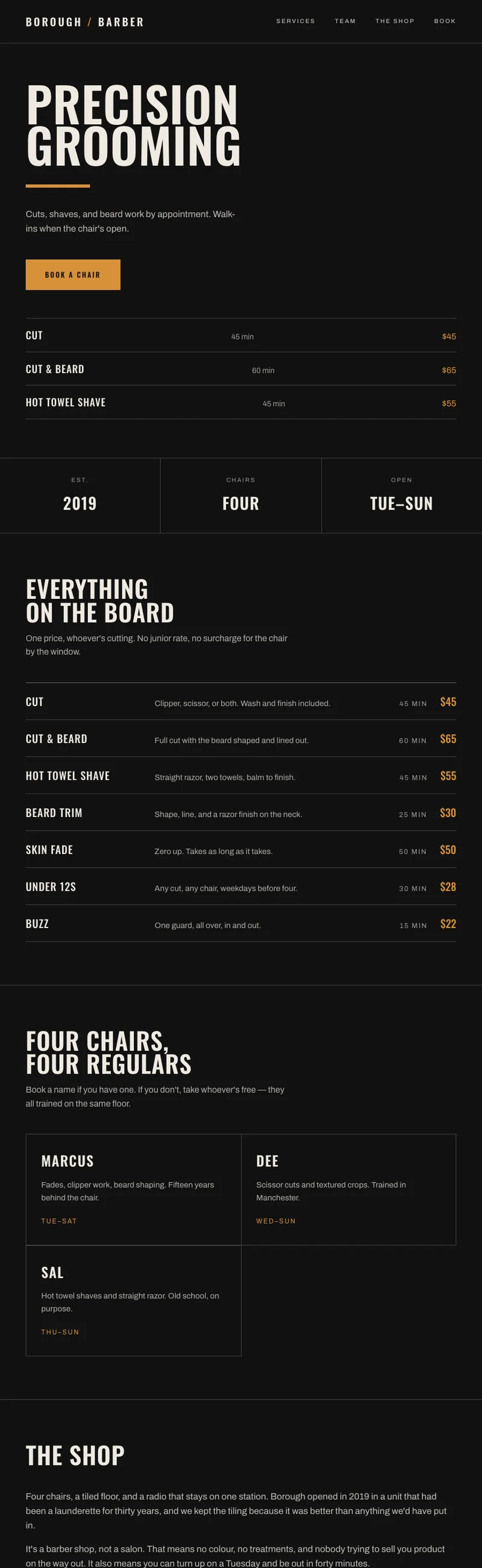
A four-chair barber shop. Everyone arriving at the site wants one of two things, and most shop sites make you hunt for both.
The premise
An appointment-and-walk-in barber shop with four chairs and a regular clientele. Not a luxury grooming lounge — a good shop that is busy.
The problem
Barber sites tend to open with atmosphere: a slow video of clippers, a paragraph about craft. The two questions people actually have are what it costs and when they can get in, and both are usually three clicks deep behind the mood.
The approach
Prices and availability above the fold
The service list with prices sits at the top of the page, not on a separate menu page. Booking and walk-in status sit beside it. The atmosphere still exists — it is just doing its job underneath the answer rather than in front of it.
Condensed type because the list is the layout
Oswald sets long service names in a narrow column without wrapping, which is what lets a price list stay a list rather than becoming a table. A wider face would have forced either smaller type or fewer words.
Amber on near-black, and only amber
One accent, used for prices, booking and nothing else — so the eye learns in about two seconds that amber means 'this is the actionable part'.
Named chairs, not stock faces
The team section names the four barbers rather than showing generic portraits. In a shop this size people book a person, not a business.
What I would want before building it for real
The dark ground was the hardest part to keep readable. Every text value on the page was measured against the darkest patch it actually sits on rather than against the nominal background colour.
This is a concept, not client work. Borough Barber is not a real business. The site was designed and built end to end to work through a specific problem, and it is shown here as design thinking rather than as a job I was hired to do.